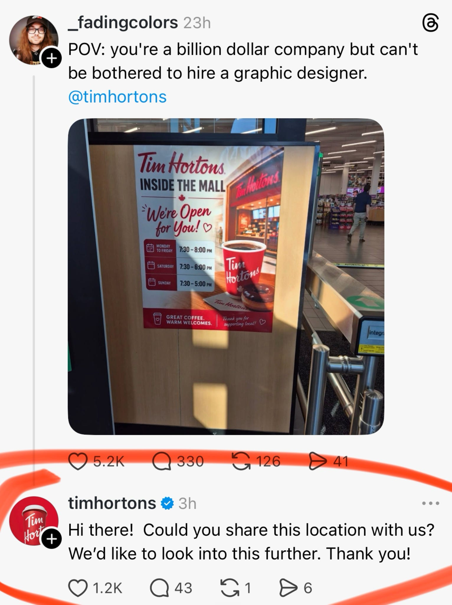
I got sent a post this week with a red circle drawn around part of it, theway you’d circle something in a police photo.
A guy named Derek had posted a snap of a poster outside a Tim Hortons (an 11.4 Billion dollar company) in a random shopping mall. The poster (shocker) is AI. You can tell in about a second and a half.
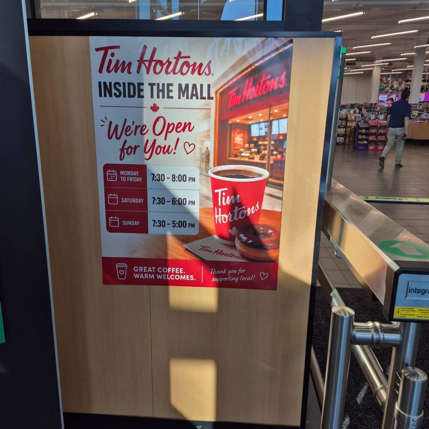
It has all the slop hallmarks - The hearts. The three little bullshit excitement lines next to “We’re,” as if the word has just had a coffee?.. I guess? A small, smeared person standing to the left of the storefront, who nobody asked for, who has no job in the picture, and who, if you look at him long enough, starts to look like he knows.
Related Reading from August last year:

Down the bottom, in cursive: “Thank you for supporting local!” With another heart. At the time of writing it has 5,300 likes, 340 replies and 103,000 views. (For a guy with 96 followers posting a photo of a fucking sign.)
Then, like a mascot showing up to the game at halftime… the official Tim Hortons account slides into the replies and asked which location it was so they could “look into this further.” Bless. (That reply got 1,400 likes on its own.) I don’t know, I guess people were cheering a corporation for noticing its own poster?
Bottom line is, they hate it, and I want to spell out why, because I’ve written a lot here about what AI is doing to the people who draw things for a living. This one is about what it’s doing to the people who have to actually look at the drawings.
The usual move (especially for boosters) when an artist complains about AI is to say we’re bitter. We’re Luddites. We’d hate it even if it were good. One commenter in the thread said exactly that: “Fine, but tell me what’s actually wrong with this poster. Something substantive. Or do you just hate it because it’s AI?”
Then a slew of total strangers (most of them not designers) answered him. -very specifically.
One said it would’ve made more sense to use a photo of the actual store, so people could recognise it. Fair. One said the layout is cluttered and has no visual hierarchy. (Basic shit for graphic design) Another said the tiled floor doesn’t line up. One graphic designer of twenty years said the thing driving him mad is how these tools jam bullet points and the same sans serif font into every single thing they make. (They do) Someone asked what “We’re open for you” is even supposed to mean as a tagline. Someone else just wrote: the random person to the left of the Tims. The small smeared man had been clocked by civilians.
None of this is elite art school criticism… It’s the sort of shit your half-blind uncle would say. That’s the point- Everyone can see it now.

The look has a name, and that name is slop…
…and in 2026 people in a food court recognise it the way they recognise a Nigerian scam email. Then they start doing the thing brands should actually be frightened of- “The minute I see one of these AI flyers is the minute I stop frequenting your business.” You see it all the time- “We’re avoiding these businesses now.” Someone noted that Taco Bell has them now. Five Guys. Goodwill did it for Halloween. I saw one woman call it digital chlamydia, which I’d like on a t-shirt, (drawn by a human pls.)
The quote posts were, unsurprisingly, the same. One, in Spanish, just said “guácala.” …which is what you say when a child shows you something they found in a puddle.
And theeeen the other one:
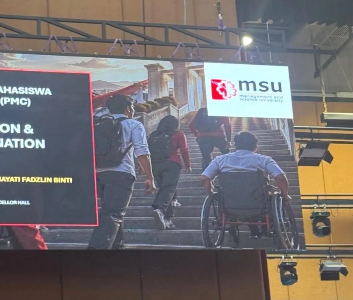
Same week, different continent- A cosplayer in Malaysia named Vee posted a photo from a university ceremony at MSU, (Management and Science University.) On the giant screen behind the stage, next to the logo sits a generated photo of students climbing the steps to a grand building. Four of them striding up the stairs.
The fifth, at the bottom… in a wheelchair. Facing the staircase.
Um.